The Comeback Candy
Bit-O-Honey
Real honey. Roasted almonds. And a satisfying chew.
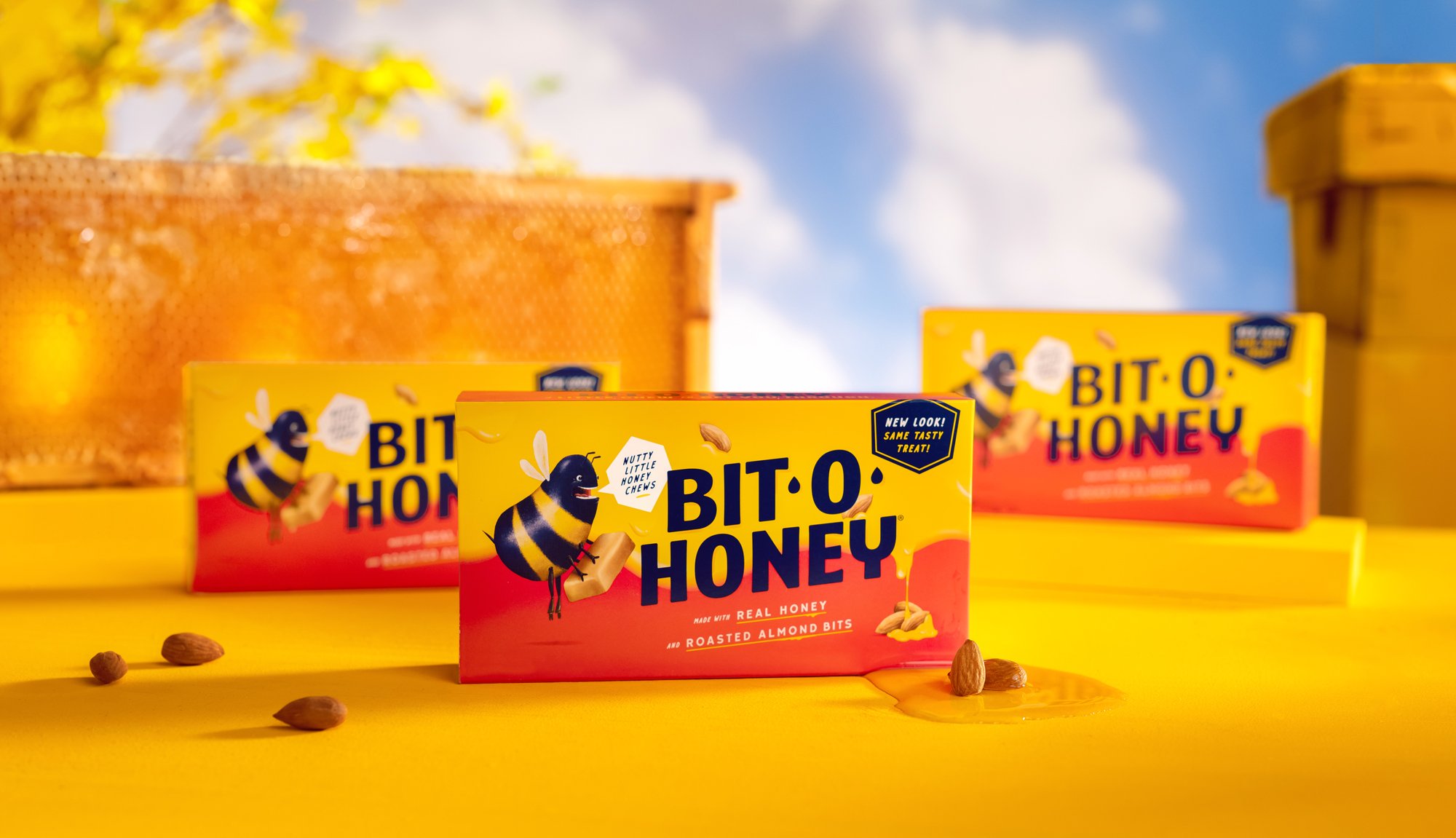
For almost a hundred years, Bit-O-Honey’s been a fixture of the grocery store candy aisle. Those who know it love it for its nutty honey taste—a refreshing change from the sticky-sweet cornstarch bombs lining most shelves. But its packaging wasn’t doing much to win over new customers, and market research showed there was an untapped audience of health-conscious candy lovers. So Spangler brought us in to rebrand the iconic line.
The new packaging and identity position Bit-O-Honey as a subtly sweet fix to get you through your day. My involvement in this project was very thorough. Along with art directing the photoshoot I illustrated the new bee, honey, almonds and all visual elements on the packaging including the design of two custom fonts that help amplify the strategic backbone and brand ethos. It all ladders up to showcase the just-sweet-enough taste perfect for a more sophisticated snacker.
Creative Direction / Art Direction / Design / Illustration
ECD: Trevor Williams
Writer: Kait Wilbur
Site Design: Baker Wright
Packaging
Photography
Website
With the launch of the new revamped packaging, we created a single-page, long-scroll experience to drive consumers and candy industry people from desktop, mobile and tablet to learn about the reintroduction of this classic candy. We also gave new meaning to the phrase “sticky header”.
The bee
The Bit-O-Honey bee was in a desperate need of a face lift. Or soul lift, if that’s a thing. Throughout the design process I explored many different illustration styles to bring new life into the bee. You can see the original iteration and version of the bee we ended up choosing had a set of crazy eyes and mouth full of teeth that evolved along the way.


